If you have a plan to begin with, it’s not difficult to satisfy the corals’ needs and the aesthetics of the layout.
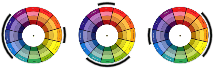
As with anything that deals with color, a basic understanding of the use of the color wheel helps to create color schemes with an orderly progression of color, color balance and harmony.

When you want to create an area with corals, and you want to avoid the “everyone showed up” look, you should try to find corals in the same color or neighbor colors. So an area with orange, browns, yellow and red corals will go very well together. Red, purple and blue will work fine too or green, yellow and orange.

It’s as simple as picking a color in the color wheel and finding its neighbors. It’s worth noting that each slice of the color wheel has different saturations and brightness. You can have a light or dark orange, more or less vivid, more grayish, etc. Even an area only in orange can be very interesting if you try to play with different tones of orange.
Very vivid colors are like people with strong, intense personalities: they can achieve great things together, but it’s much more difficult to make them work together.
Other possibility to combine colors e through an opposite strategy: instead of finding similar colors, choose a complementary color. This is an obvious way to create contrast, but if you choose pale tones, instead of creating a very contrasting area you will get a rich background against which you can place a more striking color.
You can enrich your layout by combining both this techniques: create a background with corals of 3 neighbor colors and then place a single coral with a contrasting color in the same area. This coral will immediately stand out.
Ideally, your tank will have 1 or at most 2 of these very special areas. These are the places where your eyes will be drawn.
The creation of contrast is most obvious with the use of color but it can also be created with shape or texture. In an area filled with soft corals, a hard coral will stand out.
In the same area you can play with contrast and similarity at the same time. For example, imagine this sequence from left to right: blue zoanthus, orange zoanthus and orange montipora digitata. The blue zoanthus are similar in shape and contrasting in color with the neighbor orange zoanthus. The orange montipora does exactly the opposite: it has a very different shape but the same color. Normally it isn’t a good idea to change everything at once. Two neighbors should have something in common. One exception to this is those very special areas where you place the pieces you want to draw attention. In those areas you can attack with full contrast in color, shape, etc.
If you have a valley you already created a great contrast: it’s the division between two areas. It’s normally a great idea to make the two sides of the valley similar at least in one way, whether it is color, shape or texture.